Paper prototyping in Figma
I am taking a very interesting class this semester called “Designing Interactive Systems". Last week, we explored various prototyping techniques—including the art of paper prototyping. Traditionally, paper prototypes are simple paper-and-pencil sketches of an interface or its central dialogs. Their low-fidelity nature allows both designers and users to focus on the high-level design without getting distracted by minute details.
While great on paper, pun intended, in my opinion it comes with some notable disadvantages, many of which were discussed in class:
• Action sequences are hard to convey unless you physically simulate the interaction.
• Creating numerous screens by hand can be very time-consuming.
For me, however, the primary drawback of paper prototypes is their inherent inflexibility. I love iterating through multiple design variations, but with paper prototypes, rapid iteration is a challenge. So what do you do when you are tasked with creating a paper prototype as part of your assignment?
You do it in Figma!
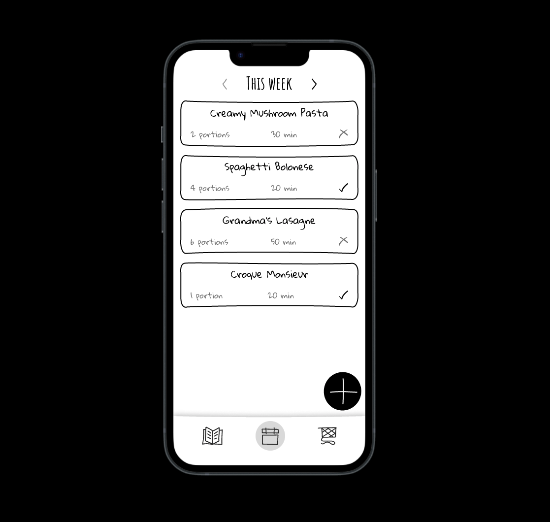
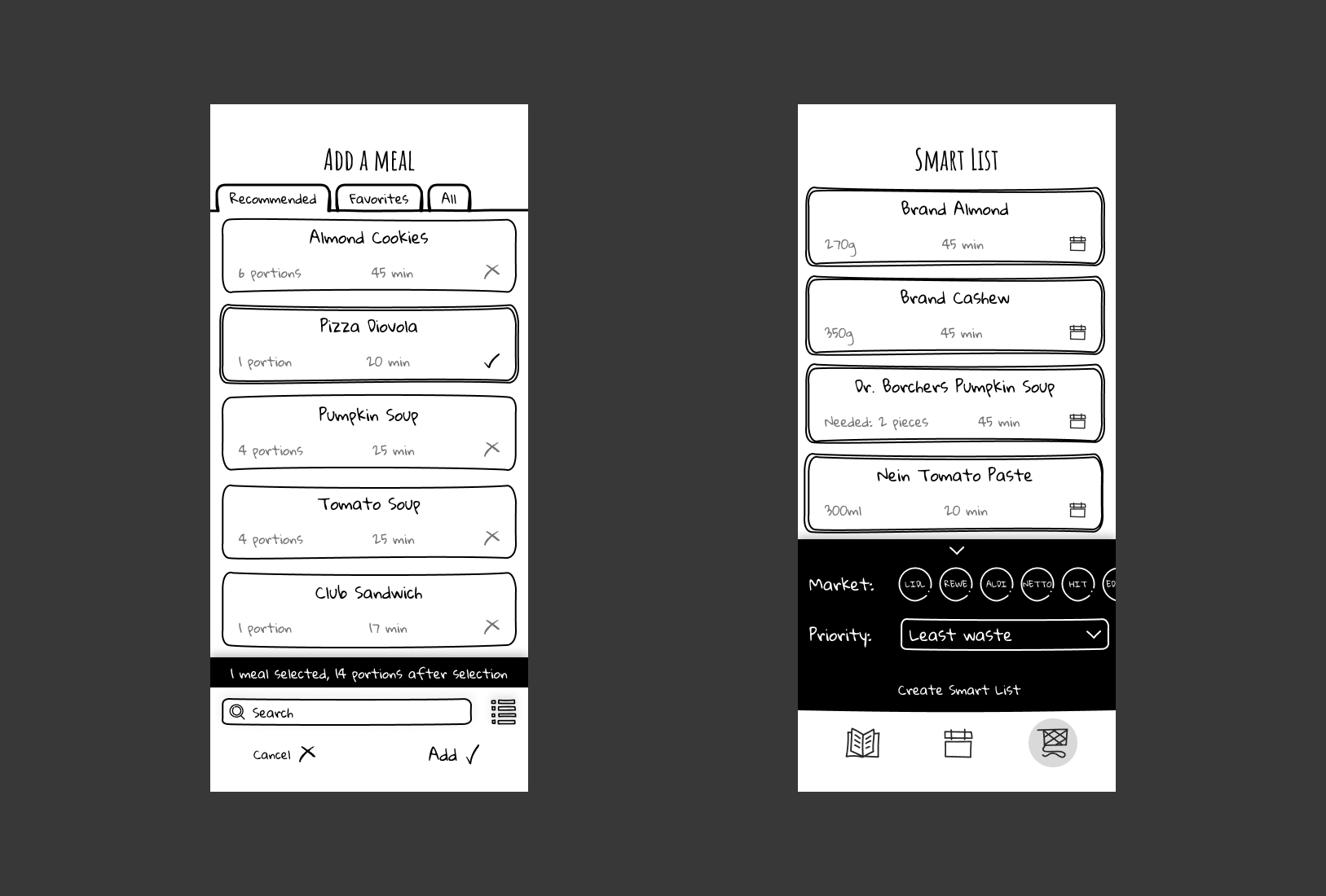
The process started with choosing the right font. I initially considered Google’s Patrick Hand because it’s readable and gentle on the eyes. However, its polished appearance didn’t quite capture the messy, authentic handwriting vibe of a computer science student. That’s when I discovered Gloria Hallelujah, which perfectly conveys a more spontaneous, hand-drawn look.

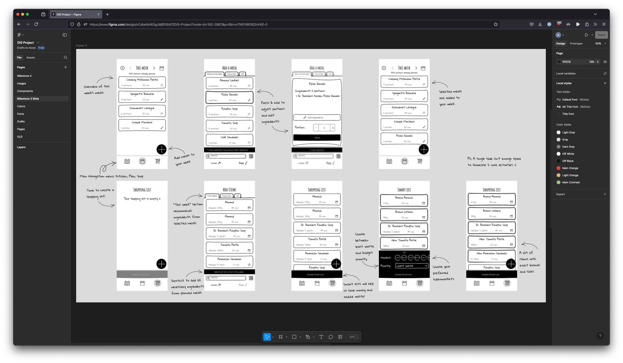
Next, I needed to establish the design components. The project involved designing around 15 pages, and creating unique hand-drawn elements for each page wasn’t practical. Instead, I sourced most of my icons from the hand-drawn icon set “Anarkey” by Anima.
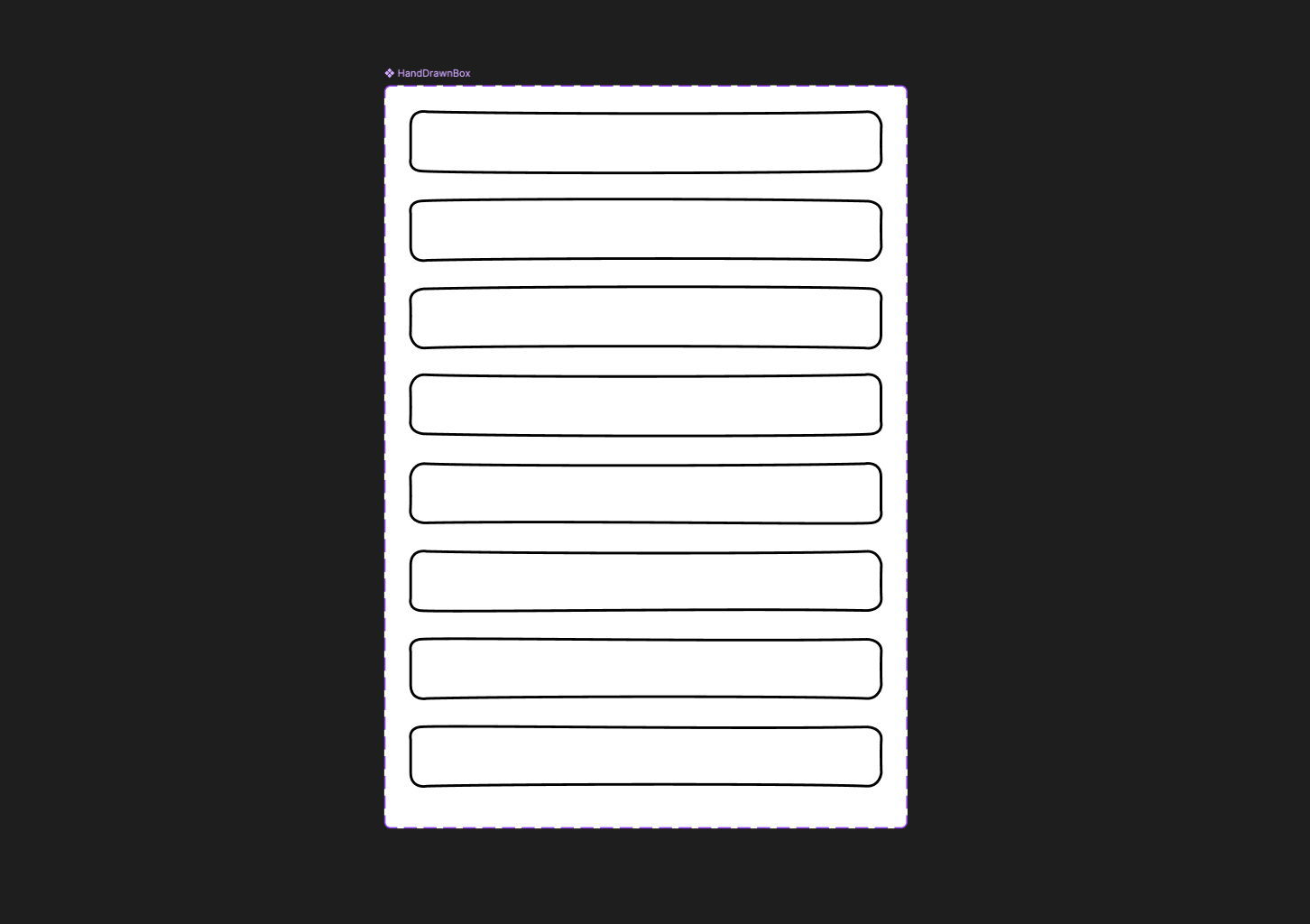
For hand-drawn boxes—which were to be used in various components such as cards, input fields, and buttons—I decided to craft my own. I initially experimented with highly distinctive boxes, but soon realized that overly unique shapes can distract the user.
To strike the right balance, I created three slightly varied versions of a basic box and then multiplied these variations by flipping them horizontally and vertically. This approach ensured that while each box retained a subtle uniqueness, they collectively maintained a cohesive and non-distracting look.
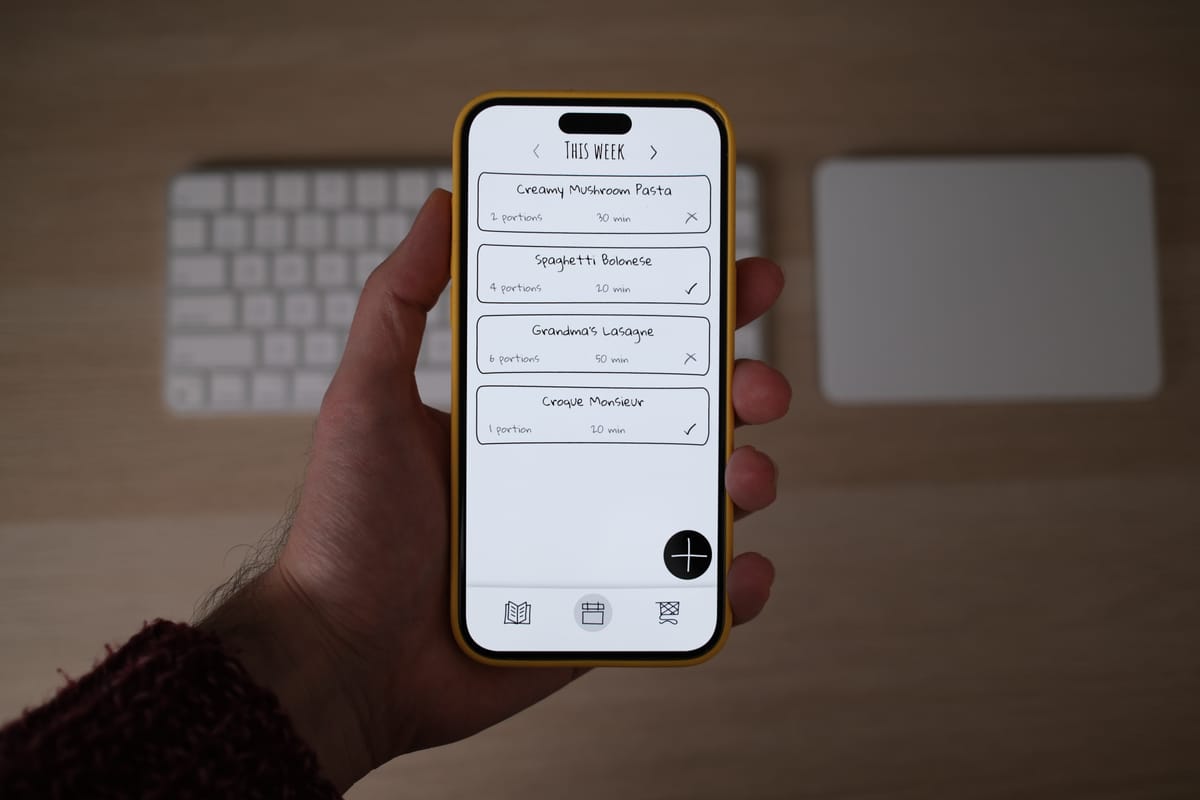
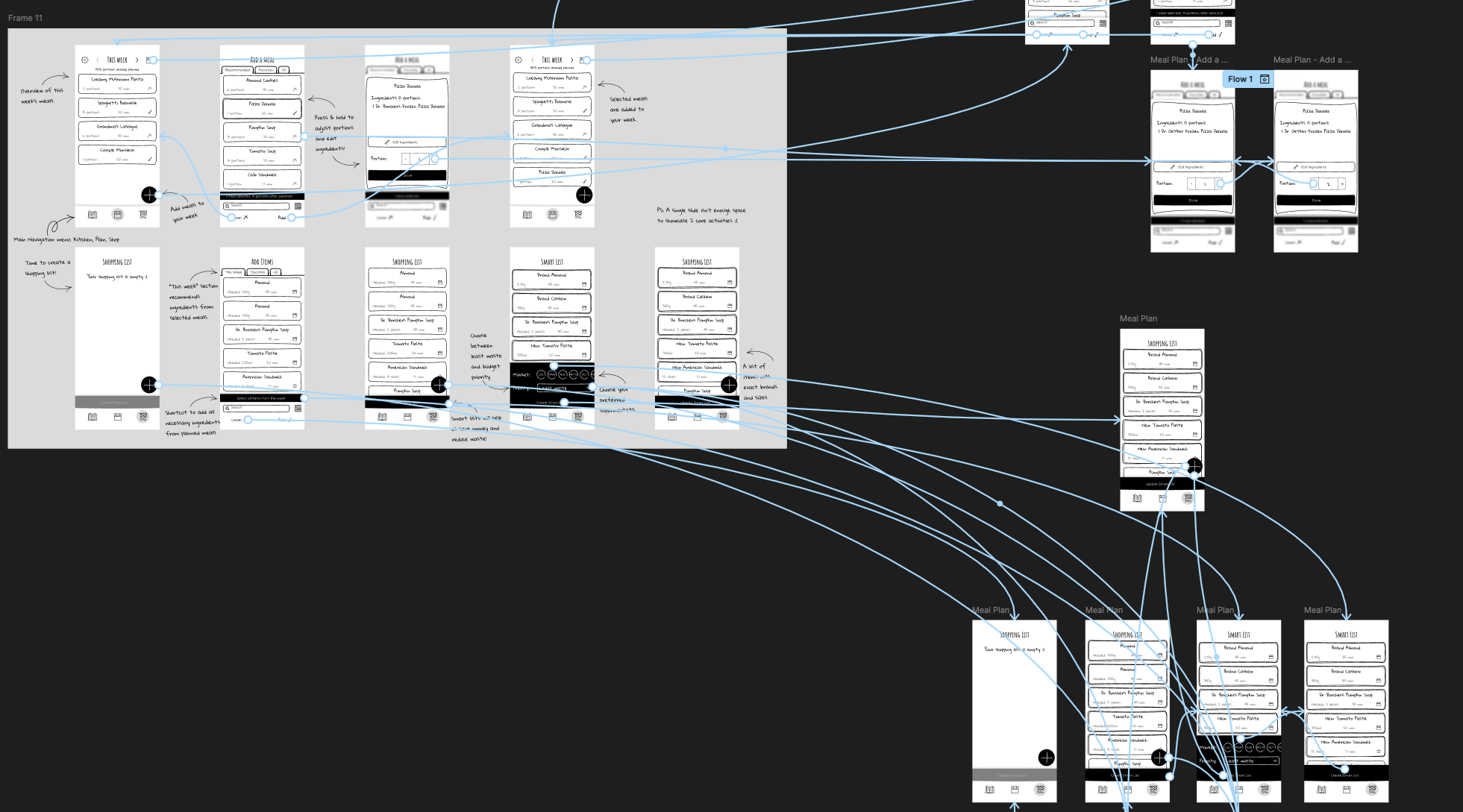
A bit of prototyping later, and voilà—the prototype was ready for user testing. We used the Figma iOS app on an iPhone to conduct our tests. Although this digital method might not fully capture the tactile feel of a traditional paper prototype, I believe it offers an ideal middle ground. I believe it strikes a good balance in the fidelity spectrum; not too low to make a bad impression because an uninitiated tester might find it ugly, not too high to accidentally confuse users with a final product.
Will I continue using this method in future projects? I’m not entirely sure. It might be perfect for testing complex interface ideas in a simplified manner, but for projects that involve well-established design elements, it might not be necessary.
If you’re interested in experimenting with low-fidelity, paper-like prototyping in Figma, I recommend checking out the Paper Wireframe Kit from the talented team at Method.